5 tips to immediately improve your jewelry window display
There is so much going on right now in retail.
We see a change of behavior of how people actually buy things today (see here) and how internet sales increase whilst brick shops struggle so hard. You would think that shops have no other choice than to either compete with internet by starting their own web shop or make some other drastic choices.
Stars!
But there is an less intrusive option to boost interest in a store and that’s the window display. Now there are a lot of stores who get it right. They have actually put a lot of effort in their window displays. But jewelers are not amongst those shops. I know; the really luxurious ones have got it right. Often extremely classical but they are never afraid to let just a few pieces in a window. Allowing people to really look at them and allowing them to be the stars of that window.

Fear never gives you good advice
But the far larger group of jewelers that aren’t at the very top, have a strategy of fear in their shops. ‘’We need to show EVERYTHING, or clients might think we don’t have it’’ Some might do that but still keep it all neat and tidy, but a large group doesn’t seem to be bothered to put items of one brand or style on a display of another company.

I don’t care?
What one is really saying with a window like that is: I don’t care. Now I know for sure no jeweler thinks of himself or herself like not caring! But this is what you communicate. Try to be as objective as you possibly can. Take a few steps back and then observe. What is your window communicating? Try to find words to describe it.

Dead flies and other little horrors
I am not the greatest visual merchandiser or anything, but my hands itch when I see these windows! And that’s not all. Dead flies, dust, pieces that are not put up straight…argh! Unfortunately, I have seen too many of these windows over the past years. Often jewelers did not allow us to do their window displays and we clinched our teeth, me and colleagues, to see how poorly the message of our brands were coming across.

Rather put money into stock than window displays
Now you read all this and you think: I am a jeweler but I am just not great at windows! I have no time and I rather put money in product than in my window displays. And I am here to try to hopefully help you see why maybe you should want to change that.

So here are 5 tips to immediately start create better windows.
-
Work together with brands.
They offer often the service to make the window display of their brand and this way you can be assured to make it easier to recognize the brand itself for your clients. If available, do ask for big visuals. See point 2.
-
Use images to seduce, inspire and get your message, or the brands message across.
Ask the brands for visuals and if they don’t have them, create your own. Look for inspiration at companies like Nike. They inspire with beautiful pictures to buy that running shoe, or the latest sneaker. Online it is even easier to use visuals, but you can also use them in your shop.
-
Leave as much jewelry out as you dare.
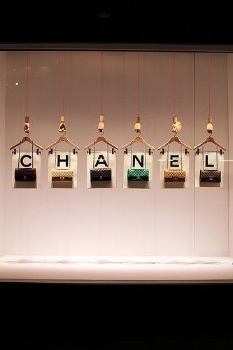
Our eyes need a bit of rest to really see a small item as jewelry often is. Try to create space. Leave more space between different brands. Just a few items say so much more than a pile of jewelry. Get the lights of your windows right! They need to shine directly onto the jewelry.
-
Theme!
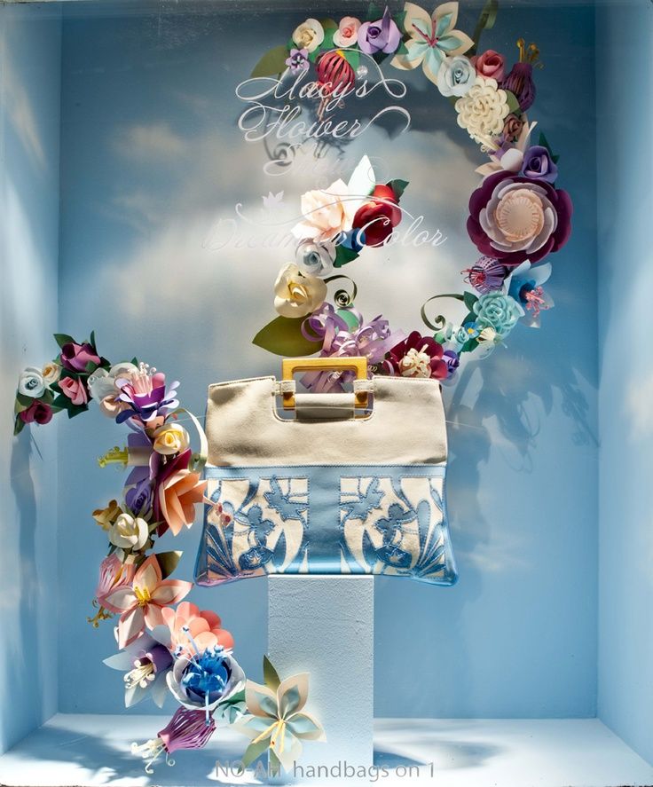
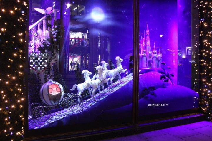
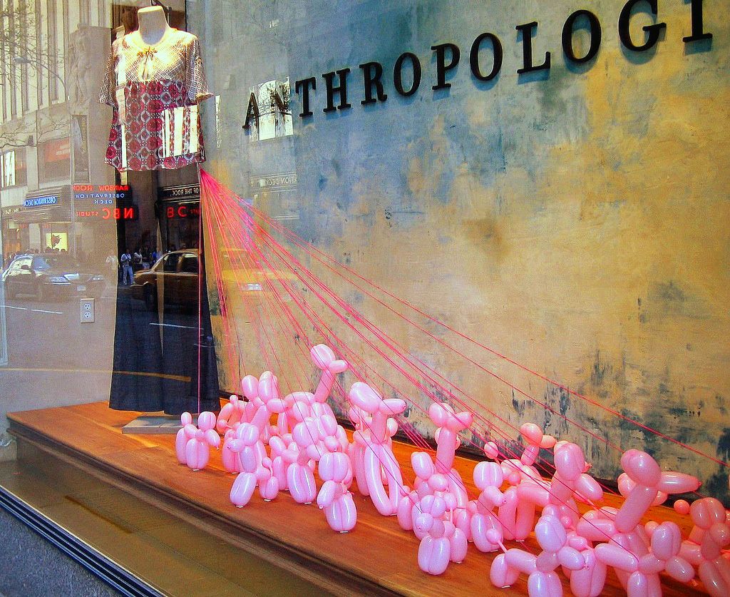
Create themes and program them. The seasons are fine, but can you do more? Get creative and think outside the box! Get inspiration from other kinds of stores. Go online and search. Pinterest, Google, Instagram, they all show so many results if you search for inspiration.
-
Clean!
What can I say? It seems obvious, but do try to clean as often as you can. And look, especially in summer time, for those dead little flies.

Here are some links for more inspiration.
If you are not great with your window displays then maybe one of your staff members is. Invest in a course visual merchandising. It WILL pay off. Would love to see pictures of beautiful jewelry stores! You can always send me pictures of your store at This email address is being protected from spambots. You need JavaScript enabled to view it.

Be creative and have fun!


Here are some links to pinterest boards to get more inspiration:
http://nl.pinterest.com/andreamalueg/window-displays/
http://nl.pinterest.com/oohlafroufrou/beautiful-storefronts-windows-store-displays/
http://nl.pinterest.com/bratenella/store-window-display/
http://nl.pinterest.com/candycane20/window-displays/
Comments (13)
Leave a comment
![]()
© 2013 - 2020 Bizzita. All Rights Reserved
Legal Information | Copyright & Privacy Policy | Term & Conditions


Annie Frances
Wow, that Louis Vuitton window display is incredible! A friend of mine owns a jewelry store and is looking for a way to draw more people in. Maybe she could do something more artistic and colorful with her window display to show off the jewelry in her store. Thanks for the help!
reply
Esther Ligthart
You are welcome, Annie! Thanks for your comment..:-)
reply
Priya Sharma
Nice tips for display of jewellery
For more jewellery designs check at Craftsvilla earring
reply
Charles Kemp
I like that there are ways to improve your jewelry store displays. It might help out a lot to do something a little different than before. I also like that you mention to clean it because that can really make a difference and make the jewels look really good.
reply
Esther Ligthart
Hi Charles! Thank you for your comment. I know....it makes a huge different, yet it's so easily neglected, right? :-) Have a lovely day, Esther
reply
Deedee Lewis
I would have to agree that you should work with the brand to find out the message they would like conveyed in the store's display before getting started. I would imagine that it would be possible to work with the brand while adding your flare to the display as well. As long as the brand agrees to the display idea you would like to incorporate then it will make for a smoother project.
reply
Braden Bills
I'm trying to find a good jewelry store. It makes sense that I would look for one with bold displays! That would suggest that they aren't afraid of their stock, and will be easier to deal with.
reply
Isabel
This is such a great article! The way to stand out now in the retail business is by creating a whole shopping personality for the store that will make customers come back - as I know I'm definitely far more likely to return to a shop if it's stood out for me and been more than simply 'bricks and mortar'. I've owned a boutique shop near the coast for a few years now, and I'm always looking to improve my shop's design. We offer an assortment of luxury dressy items (including an array of showpiece style jewellery), and I try to reflect this in my decor and in the way I present myself. And it seems to be doing ok because we're actually looking to expand! My ultimate goal however is to have a small luxury chain of shops dotted along the most exclusive spots in the country (a girl can dream right?). And because of this dream, I'm always looking to improve and fine tune my business - which is why I was wondering if I'd be able to ask you for some advice? My friend (who works within the marketing industry) has suggested that I look at hiring some interior designers to design and decorate my shop(s). She has told me that because I work within the fashion industry, that looks and aesthetics are everything, and I think she's right based off my own experiences! So I've been looking at hiring some 'shop specialists' (so to speak) to help me out, and I was wondering if you'd be able to point me in the direction of any good retail designers? I've been looking at Green Room Design (here's a link to their site) and was wondering if you'd heard of them? My friend said they were really good but I wanted to get a few more names of different places first - so if you'd be able to give me any recommendations that would be fab! Thank you for the article - keep up the fantastic advice xx
reply
amit
nice designs and article
reply
Esther Ligthart
Thanks, Amit!
reply
Daina Gilbert
Nice Tips for display of jewelry.
reply
Taylor
For me, Hermes ticks all the boxes when it comes to a sophisticated, yet enticing window display. So many boutique retailers have the most dull window displays, for fear of ruining the classy image they're trying to achieve. Hermes just goes to show you can be fun AND sophisticated.
awesome collection of displays thanks for sharing!
reply
jewellery box
it is really helpful 5-tips-to-immediately-improve-your-jewelry-window-display for me to improve my jewellery display cabin.
reply